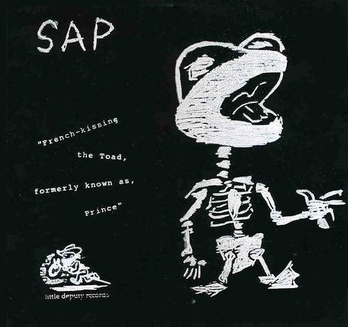
 This (or something resembling this) was supposed to be the cover for the Sap side of the Sap-Coward split lp from way back in 1997. As you can see from the above picture, it is not the cover.
My friend Ben, who was in Sap, wanted me to draw a dragon for their next record's cover. I wanted to do it, so I started doing little sketches. I was stoked, it would have been my first bit of art work for a full size album. I showed him a couple of them, but they weren't quite what he had in mind. Finally, I came up with one that was pretty close to what he wanted. I remember giving him a copy of the little drawing. I was going to do one more final version to make for a classy, economical design. A small drawing, silk screened in white ink on black album cover blanks. It would have looked fucking sharp.
A couple of days later, Ben comes in to the record store I was working at with this odd look on his face.
"The covers are already made."
I was astonished. "What do you mean? I haven't even finished with the drawing yet."
"Joey just did them and... well, they're done."
Done was correct. The covers were awful. Just awful. Joey was the guy who was putting out the record, and I guess it was ultimately his call to make something so lame. But yeeesh. This is what he went with. Oh well, it's not my label.
As a consolation, someone mucked up my little dragon and stuck it, along with a logo I designed onto the label when they pressed the records.
What makes me sad is that the record is pretty good. Even after all these years it still sounds fresh and exciting. Too bad for Sap, screwed by the cover.
The cover is supposed to be the shiny thing that grabs the attention, so that people will see it and want to buy it. Sure, the fans of the band will buy it, but what about the people who think Sap comes from trees and don't know squat about some tough prog-punk paired with some very doomy sounding sludge from Coward. What about all the strangers? Who's gonna buy something if it looks like it comes packed in cooked, dessicated shit on cardboard?
You should hear this thing. Am I wrong?
